For part 2 of this Bursting the Bubble Sheet series, I’m going to zoom out to ensure I’m clearly communicating the forest of this project before diving into each tree:
There’s an unfortunate fact pattern where deceptively portrayed K-12 data is being used to undermine communities’ faith in their local public schools as a marketing tool to sell a variety of so-called “solutions” like software, curriculum packages, taxpayer-funded private school vouchers, and other “reforms.”
When NC taxpayer money is used to make and show data that supports the messaging of current and potential private contractors, instead of being used to offer an honest analysis and meaningful support to public school students, taxpayers should know.
In the first post, I pointed out how a recent presentation to the North Carolina State Board of Education contained a series of graphs on student test data that selectively narrowed y-axis ranges to produce a visually exaggerated trend line and pandemic performance gap.
If you missed it, you can catch up with the 30-second summary video below:
Those graphs were created by NC-based data company SAS whose co-founder and CEO James Goodnight is a top political donor. Among other data contracts awarded to SAS by the State of North Carolina, the NC Department of Public Instruction uses SAS’ Education Value-Added Assessment System (EVAAS) – a K-12 test data translation tool.
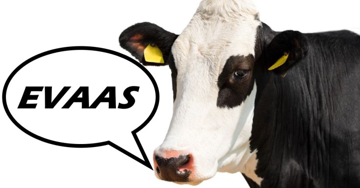
EVAAS is modeled after a value-added one used in agriculture to increase plant growth and cull dairy herds. It is used in North Carolina to assess public school student growth, staff effectiveness, create school report card grades, and award bonus pay.

In 2017, educators in Houston successfully won a case against use of EVAAS in their district after a judge agreed that the system is too flawed to make policy decisions such as employment status. In 2022, North Carolina educators and supporters pushed back against a “teacher licensure reform” proposal that could have expanded the stakes of EVAAS in employment decisions here. I wrote extensively about that proposal on this blog in 2022.
Perhaps to combat the “secret formula” criticism of EVAAS among school staff in Houston and North Carolina, SAS published this report in 2023 and relied heavily on research produced earlier this century (over a decade before the Houston court case) to defend its formula.
It’s notable that it’s not just frontline educators who have expressed concerns about the invalidity of EVAAS as a tool to measure students, teachers and schools in a similar manner as plants and dairy. Despite being a key salesperson of the 2022 NC teacher licensure reform pitch in State Board of Education meetings, the NC Department of Public Instruction’s Tom Tomberlin admitted this about EVAAS in an August 2022 licensure subcommittee session:
“EVAAS is problematic even for teachers who have it because in any given year, no matter how much our teachers grow, there will be a certain number of them who aren’t meeting expectations in that year…because it’s always based on that average in that year and there will be a certain percentage of teachers that will always be (labeled) ‘Not Meeting Expected Growth’ in that year.”
While Mr. Tomberlin uses the word “teachers” in the quote above, the same statement is true if you were to replace “teachers” with “students” or “public schools” because it’s the same system layered upon itself to manufacture labels for each group.
An admission that a formula stacks the deck against portrayal of student, teacher and school performance with a zero-sum premise deserves to ring alarm bells louder than the deceptive narratives fostered by laundering data to look unclean.

Taking advantage of folks’ mathphobia empowers these deceptive data demonstrations.
The goal of this Bursting the Bubble Sheet series is to support your growth in understanding these concepts. Unlike EVAAS, I promise not to impose a quota on who can meet or exceed expected growth.
Stay tuned as I break down data concepts and use primary sources to illustrate their use. Mickey Mouse from “Steamboat Willie” makes a cameo in the next post to help explain percentiles.

You can subscribe to this blog or follow my Educated Policy page on Facebook, find me on X (Twitter) @educatedpolicy and I guess I’ll dust off my Instagram @kim.mackeync

